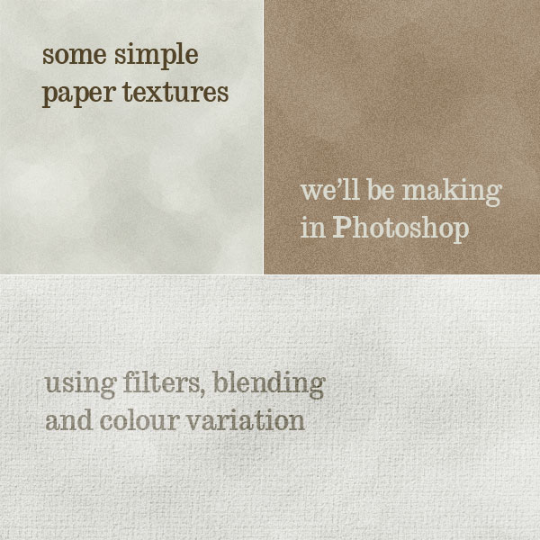
This year has seen a big increase in grungey / textured / hand-drawn styled website designs. By nature I tend to design a cleaner look myself, but I thought I'd try my hand at grunge today and write up a tutorial on creating a simple paper texture from scratch in Photoshop then marrying it with a web layout to create a neat design.
Then later this week we'll take this same web design and I'll show you how you can take remixing even further than just changing backgrounds and colour schemes, that in fact you can change the entire style of a design. But first let's make our paper texture site!
Part 1 - Creating a Paper Texture

There are three different ways you can get a textured paper look:
- Scan in your own paperCheck out Bittbox's Make an Awesome Grungy Paper Texture Tutorial
- Use someone else's textureThere's heaps of sites that list textures around, check out these links: Bittbox | TextureKing | Psdtuts+ Textures
- Make it in PhotoshopThis is what we're going to do!
Making a texture in Photoshop will generally result in a more stylized than realistic look, but it has its own charms. Also it means you don't need any external images.
Step 1

So first we'll start a new document, this canvas is 1200px wide x 900px high. Next we fill the background layer with a beige colour - #e8e8e2.
Step 2

Now create a new layer on top and make your foreground and background colours: #979a8f and #cfd1c5which are variations of the original colour. Then go to Filter > Render > Clouds
Step 3

Now we run Filter > Artistic > Palette Knife with the settings shown in the image above. Palette knife turns our clouds into blobs ... sort of, eventually this will give a slight crumpled feel to the texture.
Step 4

Next we'll add some noise to the canvas by Filter > Noise > Add Noise using the setting shown. This should make our texture look rough.
Step 5

Now we take our noisy, crumply layer and set it to Multiply and 30%. This will tone it right back.
Step 6

Now create a new layer on top and make your foreground and background colours: #42433e and #cfd1c5 - which is a darker version of the last set so that we get more contrast this time. Then go to Filter > Render > Clouds
Step 7

Then we again run the Filter > Artistic > Palette Knife filter.
Step 8

And this time we set the new layer to Overlay and 60%. This should give our texture a bit more depth.
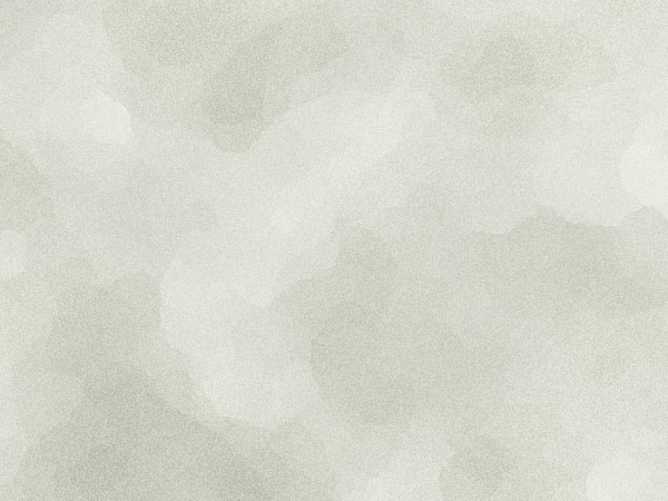
And that's it! This is our texture!
Step 9

For this tutorial the light texture is perfect, but you can easily make other variations just by messing about with blending tools. For example to make this dark brown paper texture:
- Take the light version and press CTRL-U to alter the Hue/Saturation, set the sliders to -30, -10 and -5 respectively.
- Duplicate the layer and press CTRL-SHIFT-U to make it black and white
- Then still on the black and white layer, go to Edit > Adjustments > Brightness/Contrast and go to -30 and +30 respectively
- Now set the black and white layer to Overlay
- Then create another layer on top and fill it with #beac93 then change that layer to Multiply.
- Duplicate the Multiplied layer
- Then duplicate the black and white layer and pull it right to the top. Set it to Overlay and 20% and rotate it 90' to get a bit more depth to the texture.
Step 10

If colour variations aren't enough, you can also change the feel of the texture with the use of different filters. For example here we've made a more parchment-y feel by taking our light texture and:
- Grab the first crumply/noise layer and run a Filter > Texture > Texturizer and use Canvas, 75% and 2for your settings
- Grab the second crumply/noise layer and run the same filter
- Now duplicate the second layer and rotate it by 90', keeping it set to Overlay and 60%.
- Create a new layer on top and fill it with white - #ffffff
- Run a Filter > Texture > Texturizer and this time use Canvas, 200% and 16 then set this layer toOverlay and 20%
- Now create another layer on top and again fill it with white, this time change the layer blending mode to Color and 53% to get our texture a bit whiter.
Final paper texture notes
Now that you have a texture you can of course turn it into a seamlessly tiled background.
For this tutorial we will be using the first texture we made - the one from step 8.
Part 2 - Creating the Website Layout

So now we're going to create a portfolio layout to go with our paper texture. Here is the approximate structure for the homepage. As you can see it's a bit more of a complicated structure than in the previous web layout tutorial because this time we have a layout inside the layout.
So our overall grid is a three column grid, then in the main panel, we've used that grid to break the area into two main spaces, one is the size of column 1 and the other spans over both the other columns.
Step 13

So first we're going to create a working area and lighten it up. So here I've dragged two guides on to the screen, one at 100px and one at 1100px - that makes the area I'm working in exactly 1000px which is perfect.
Then we create a new layer and draw a big white box as shown.
Step 14

Next we'll set the white box back to 25% opacity.
Then we're going to roughen it up. There are lots of great grunge brushes around, but for this step we'll just use one of Photoshop's standard brushes. You can see it in the screenshot above with the 60 underneath it.
If this brush isn't appearing for you, just click that little right arrow at the top of the brushes screen and choose Wet Media Brushes, then click Append to add them to your current set.
Step 15

So choose the Eraser Tool (E), select that brush we just mentioned and then go around the edges of our shape and just roughen it up however you feel. I've left the top edge intact as you can see.
Step 16

Next create a new layer just below the white box, and draw in a Radial Gradient (G) going from white to transparency. This is just going to highlight where we'll be placing our logo in a second. Set the layer toOverlay and 70%.
Step 17

Now we'll add a little "logo" - in our case just a word set in a nice typeface. The font I've chosen here isEgyptian710 BT which is quite a well known font and suitable for our purposes because it's very uneven looking - capital letters are thicker than the lowercase letters - and the slab serifs look kind of typewriter-ish which goes with our paper theme.
Step 18

Next we'll make a watermark just to add a bit more stuff in the background. Actually you can go crazy and add tons of stuff into the background texture, but we'll settle for a single watermark.
So here I've written out the word Folio in some random font (HumstSlab712 Blk) and I've set it in this colour - #c5c6ba.
Step 19

Now let's change the blending mode to Colour Burn and 70% and we'll add a 1px stroke as shown. Notice that for Fill Type I've used a Pattern and then chosen a texture I had hanging about. When combined with a low opacity (36%) and blending mode (Multiply) this makes our outline look like it's faded out in parts.
Step 20

Now we'll move our watermark to sit behind the logo.
Step 21

Next we're going to make a little horizontal separator element. So create a new layer and draw in a 1px line in the dark brown.
Step 22

Now grab that same old eraser brush and just go over the line erasing little pieces out of it so it looks distressed. Also get rid of the edges so that it starts at the same place as the white box.
Step 23

Next create a new layer below and draw in a brown box that is about 3-4px high as shown.
Step 24

Set the brown box to Multiply and 5%. This will be a kind of shadow to our separator.
Step 25

Next create a new layer and this time draw a white box about 20px high above the line.
Step 26

Set the white box to about 50% opacity and once again using our brush, just erase the top in a messy fashion.
Step 27

Now repeat the last three steps to draw a second white box, but this time when you erase it, erase more so that it's a thinner white strip.
When both white layers are combined they will give a messy sort of highlight.
Group these separator layers into a single layer group.
Step 28

Now we can duplicate our layer group to have three copies to form our horizontal grid area as shown.
Step 29

Here I've just placed some content in. As you can see I've mixed a little bit of the display typeface with a regular HTML typeface.
For the regular text I've actually used Cambria which is a Vista font. In the CSS you would have it default back to Georgia for people who don't have the Vista fonts. If you, yourself don't have the Vista fonts, you can get them freely & legally, just follow these instructions. There's a couple neat fonts, I quite like Calibri as well.
Step 30

Now we're going to add our main panel. So draw in a large rectangular box in the dark brown colour -#1e1a19 - and do so using the Rounded Rectangle Tool (U) with a Radius of 5px.
Step 31

Now zoom into the top left corner and grab a small square selection then fill it in with the same dark brown colour. We don't want a curve in this corner.
Step 32

Now zoom in on the top right corner and using the Polygonal Lasso Tool (L) while holding shift down make an angled selection like shown and then hit Delete.
Step 33

Now in a new layer above draw in a square of a lighter brown colour, say #352f2b, and then make another angled selection and delete away half the square so you are left with a triangle which is 1px away from the edge.
Step 34

Next create a new layer and zoom in to the top left corner again. We are now going to make our tab shape. We do this using the pen tool and a few very precise clicks. In the image above I've switched off all the background layers so you can see the shape exactly. Here's how you make it:
- Start on the bottom left point and just click a single point in
- Then hold down SHIFT so that you are getting a dead straight line and click the next point along the line, hold the mouse button down as you click so that the point has handles and drag upwards a little bit. This will mean the next point you click is going to have a curve going between.
- Now click the third position and again hold the mouse button down and also hold SHIFT down to drag the handles out at a right angle. You should be able to get that perfect curve. Having shift held makes sure the angles are all nice and precise so it's just a matter of getting the size and positioning right. It may take you a few goes, but the good thing is you can just press CTRL-Z to undo if you don't get it right, and if you need to go back more than one step, just press CTRL-ALT-Z
- Next while holding SHIFT down click the fourth point, again holding the mouse down and dragging right so that you get handles appearing. This handle you can see in the image above (because it's one of the last two points before I screenshot). As you can see the handle should be dead straight - this is ensured by holding shift down.
- Finally, hold SHIFT down and click the fifth point and again drag right. This will give you that awesome final curve.
Step 35

After you make the fifth point, you can just fill in the remainder of the shape any old how, because we're going to just cut away the bottom edge to be perfectly straight anyway.
Once you have completed the shape, right click and choose Make Selection.
Step 36

Now you can fill in the shape with dark brown to match the main box. Then cut away the bottom extra bits so it's nice and flat and sits perfectly on top as shown.
Step 37

Next we'll duplicate our tab layer and move the new one below the old tab (so the brown one looks like it's in front). Then right-click on our new tab and choose Blending Options and give it a Colour Overlay of this nice reddish-orange colour - #cc5630. The reason we do a colour overlay and don't just fill in the tab with the new colour is that if you do the second method you will get a few left over brown pixels showing through.
Next hold down CTRL and click on the first tab then choose the Rectangular Marquee Tool and press the right arrow a few times until your selection has moved along to overlap with the orange tab. The reason I say you should choose the marquee tool in this step is that to move a selection you must have a select tool up. If instead you had the regular arrow tool selected you would actually move pixels around as well as the selection. Try both and you'll see what I mean.
Step 38

Now we create a new layer in between the two tabs and fill in our selection with a darker orange colour -#b44724. Then hold down CTRL and click on the orange tab layer, then click CTRL-SHIFT-I to invert the selection and click on the middle layer and hit Delete. This should leave you with only the darker orange part that overlaps the orange tab.
Step 39

As you can see we've created a sort of shadow on our second tab.
Now if I do say so myself these tabs look awesome, and the reason they do is because they overlap. Unfortunately this also makes them harder to work with in HTML. You can however do a variety of things with transparent PNGs, or alternately just make text change colours in rollovers and not worry about changing tab colours. Anyhow this is all a bit beyond the scope of this tutorial. Suffice to say the menu might be a bit tricky to build.
Step 40

So here's our layout so far. I've added a couple more tabs and given them some text.
Step 41

Now we'll draw in the featured work area. This will be a simple white rectangle where the work will go. Then behind that create another layer and use the Polygonal Lasso Tool (L) to draw a kind of wonky rectangle and fill it with a dark, dark brown colour - #0e0c0c.
Step 42

Next we'll add some descriptive text on the left and the item itself. Notice that with the text I've used a dark brown for the two descriptors (Project Title and Project Description) this makes them fade into the background which is good because they aren't that important. The title of the project and descriptive text on the other hand stand out. These last two items are set in a light beige colour picked from the background with the title being brighter than the text.
Also I've added a faint radial gradient to the work sample going from white to a light beige - just because I love radial gradients and can't get enough of them :-)
Step 43

Now finally I'll add a couple of little hand drawn doodles to finish off the design. For these I've used David Leggett of Tutorial9's excellent and free hand-drawn brushes. You can add brushes by opening the brush palette as shown, clicking on the little right arrow and choosing Load Brushes, then selecting the brush file you downloaded.
Because the brushes are much bigger than I want them it's important to sharpen the layer after you've resized it. So here I've shrunk the arrow down and then run a Filter > Sharpen > Unsharpen Mask to fix it up.
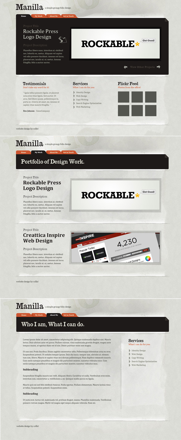
The Design

So there we go, the final design, with a couple of variations for different pages. The final PSD designs are of course up on ThemeForest for sale, and I'll add the homepage PSD to the Plus system.
Final Thoughts
So that's my take on a paper texture sort of layout. There are lots of designers who do this look much better than me, in particular check out Liam McKay's work at WeFunction and also take a look through design galleries like WebCreme and you'll find lots of neat grungy, papery designs.