
Easter Sunday is drawing near very quickly, so why not celebrate it
with some festive wallpaper? What are we going to create? How about a
simple background, some subtle texture, and a few chicks—no, not that
sort of chicks, the other sort! Let's get started ...
What we'll be making...
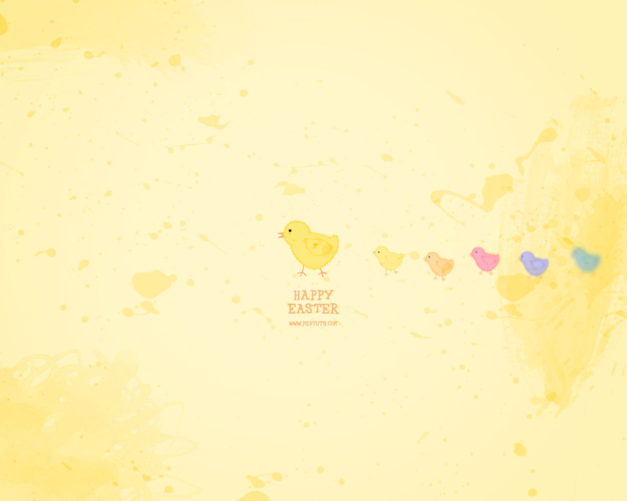
Here's the wallpaper we're going to be illustrating from scratch. Click the image to see a large version.
Editor's Note: This tutorial was originally published in the Czech language at Grafika Online. Grafika have kindly given permission for Vaclav to republish here on Psdtuts+ for those of us who haven't quite mastered Czech...
Step 1
Create a new Photoshop document (Ctrl + N). Size isn´t important for
now. Set a white background, select the Ellipse Tool (U), and
draw two ellipses—the base of our chick. While drawing, press the Shift
key to have both ellipses in one layer. Also, don´t forget to draw the shapes
as a Shape
Layer (first icon in the menu bar), so we can modify them later.
now. Set a white background, select the Ellipse Tool (U), and
draw two ellipses—the base of our chick. While drawing, press the Shift
key to have both ellipses in one layer. Also, don´t forget to draw the shapes
as a Shape
Layer (first icon in the menu bar), so we can modify them later.

Step 2
After that, select the Direct Selection Tool (A). Select the two side
points of the second ellipse and move them up a little...
points of the second ellipse and move them up a little...

Step 3
...and at the same time, adjust the anchor points to make them less round. As
shown on the next picture, you can also rotate the top point.
shown on the next picture, you can also rotate the top point.

Step 4
When you´re satisfied, click the Combine button. This function
merges the two shapes into one.
merges the two shapes into one.

Step 5
Next, adjust the connection between the shapes (sure, there´s only one shape
now, but the connection is too sharp). The method is quite easy. Select the
Pen Tool (P), add two new points around the old one (new points are
highlighted on the picture), and than delete the old point (marked with an x on the
picture). If the connection is still not round enough, repeat this process few
times.

Step 6
If you want, you can also add the tail. With the Pen Tool (P), add a new point
and move it upward. Then recolor the layer into the final color—light yellow #FDED95.
and move it upward. Then recolor the layer into the final color—light yellow #FDED95.

Step 7
The base is finished, so now you can continue with other parts. The eye
is just another black ellipse, or circle if you want, so press the Shift
key while you´re drawing. However, press the Shift after you start
drawing, otherwise you´ll set the addition drawing mode instead.
is just another black ellipse, or circle if you want, so press the Shift
key while you´re drawing. However, press the Shift after you start
drawing, otherwise you´ll set the addition drawing mode instead.

Step 8
The chick´s beak can be drawn with a polygon. Therefore, use the Pen Tool (P) and draw a
shape similar to the one on the screenshot. Don´t forget to move this layer
under the base layer. The color of this shape is
#F7BF86. You can easily change the shape color when you double-click the
preview icon in the Layers palette, or set the background color and then press Alt + Backspace.
shape similar to the one on the screenshot. Don´t forget to move this layer
under the base layer. The color of this shape is
#F7BF86. You can easily change the shape color when you double-click the
preview icon in the Layers palette, or set the background color and then press Alt + Backspace.

Step 9
Draw the legs the same way, it´s just few more points and
mouse clicks. It´s not necessary to have both legs in one layer. If you want,
you can draw only one leg and duplicate it (Ctrl + J). But this time
the regularity is not important—in fact, it's better if they aren't too regular, as that will fit the style of the illustration a lot better.
mouse clicks. It´s not necessary to have both legs in one layer. If you want,
you can draw only one leg and duplicate it (Ctrl + J). But this time
the regularity is not important—in fact, it's better if they aren't too regular, as that will fit the style of the illustration a lot better.

Step 10
Here is the chick in 100% view ... pretty cute!

Step 11
The only thing missing is the wing. We want a very simple chick, but
missing wings is perhaps a bit too simplistic :-) As a base, use again
the ellipse...

Step 12
...and again transform it like the body by moving the side points upward...

Step 13
...and rotate them clockwise a little (Ctrl + T).

Step 14
Recolor it into the darker yellow color (#FBE56E) and - whoa! The wing
is too strong. Maybe we could make only an outline. So, why not? Select the Path Selection Tool (A),
select the shape, copy it (Ctrl + C), paste it (Ctrl + V),
resize it to 90 % (Ctrl + T)...
is too strong. Maybe we could make only an outline. So, why not? Select the Path Selection Tool (A),
select the shape, copy it (Ctrl + C), paste it (Ctrl + V),
resize it to 90 % (Ctrl + T)...

Step 15
...and set the Subtract from shape area mode. As you can see on the
next
picture, resizing is not the same thing as expanding, therefore the
outline is wider on the sides and narrower on the top and bottom.
Unfortunately, Photoshop doesn't have more functions to work with vectors (like
Illustrator), so if you want an accurate outline, you need to switch for a
moment into Illustrator.
This leads us to an important question which I'll answer before I get
flamed in the comments for it... Why not just create this in
Illustrator?
The answer is that when
you´re creating graphics for screen (in our case a wallpaper), and not for print
(for example a poster), it doesn't make that much difference whether it's Photoshop or
Illustrator. Both have functions to work with vector layers, but in
Photoshop you can also easily add effects and modify the graphics. Besides, this
site is about Photoshop, and I really like it :)

Step 16
But let´s get back to the chick. In the 100% size, it looks like this. The wing is
looking nice, what about adding an outline around the body too?
looking nice, what about adding an outline around the body too?

Step 17
Why not? Just use the same method. Duplicate the base layer (Ctrl + J),
select the shape, copy it, paste it, resize it, and set the mode to subtract.
Here you can very clearly see that the resizing is really not the same thing
as expanding the shape...
select the shape, copy it, paste it, resize it, and set the mode to subtract.
Here you can very clearly see that the resizing is really not the same thing
as expanding the shape...

Step 18
...so you need to select the Direct Selection Tool (A) and move every point
where it belongs...
where it belongs...

Step 19
This gives you opportunity to play with the shape and emphasize
something and foreshadow the shape of the chick's body with the jags.
something and foreshadow the shape of the chick's body with the jags.

Step 20
Soon, you will realize that outline created as a shape gives you many
possibilities; for example, to make the wing even more irregular and wider
on the sides. Just be sure to make the irregular appearance look like your aim,
not a failing.
possibilities; for example, to make the wing even more irregular and wider
on the sides. Just be sure to make the irregular appearance look like your aim,
not a failing.

Step 21
Again here's our 100% size view. You can see the irregular outline has added a lot of character to the illustration.

Step 22
So, what´s missing? How about some stylized feathers! For
this, use a very simple duplication method. First, draw one "feather";for example, with the
Pen Tool (P), a simple quadrangle should be enough.
this, use a very simple duplication method. First, draw one "feather";for example, with the
Pen Tool (P), a simple quadrangle should be enough.

Step 23
And when you´re satisfied with the size, move the shape sideways, select the
area with Rectangular Marquee Tool (M), and define this as new brush: Edit
> Define Brush. The selection can be bigger than the shape. The important thing is
to keep the background white and the shape black.
area with Rectangular Marquee Tool (M), and define this as new brush: Edit
> Define Brush. The selection can be bigger than the shape. The important thing is
to keep the background white and the shape black.

Step 24
If you see the brush preview on the gray background when you´re entering the
new name, it´s OK (white from the background changes into transparent).
new name, it´s OK (white from the background changes into transparent).

Step 25
Then you need to adjust the brush to be ready to contour the chick's body.
Therefore, open the Brushes Palette and start by adjusting the
Spacing. The arrow on the next picture shows the sample stroke which you
can try on the new temporary layer to see the result. The Spacing is
ideal somewhere between 150 - 200 %.
Therefore, open the Brushes Palette and start by adjusting the
Spacing. The arrow on the next picture shows the sample stroke which you
can try on the new temporary layer to see the result. The Spacing is
ideal somewhere between 150 - 200 %.

Step 26
To have the feather coat more varied, set the Size Jitter to about
40 % on the Shape Dynamics tab. Again, you can see the brush
preview in the lower part of the palette (and on the left in the document).
40 % on the Shape Dynamics tab. Again, you can see the brush
preview in the lower part of the palette (and on the left in the document).

Step 27
The last thing you need to do is to adjust the brush to rotate around so that we can apply it to the
chick's body. This will be done with the Angle Control property,
where you set the value to Direction. Now you can´t see any
difference in the lower part of the palette, but try to draw with this brush
in the new layer. The brush rotates to the direction which you´re moving. This
is exactly what we want!

Step 28
Now you can draw the feather coat around the chick with mouse, but it´s not
a very comfortable way of doing things, especially when Photoshop itself can do the job. All
you need is a path and because the body of the chick is shape layer (or in other words a path), we
have half the work already done.
a very comfortable way of doing things, especially when Photoshop itself can do the job. All
you need is a path and because the body of the chick is shape layer (or in other words a path), we
have half the work already done.
The only thing needed is to "move" the path from the shape layer into the Path
Palette. Select the layer, and with the Path
Selection Tool (A), select the path. Then show the Paths Palette, where
you can see the working path (the name is in italics). This means that after
selecting another layer, this path will disappear, which isn't what you want!
Therefore, click the little black arrow in the palette and select Save Path.

Step 29
Next create a new layer (Ctrl + Alt + Shift + N) and again click the
little black arrow but this time select the Stroke
Path function.
little black arrow but this time select the Stroke
Path function.

Step 30
For the tool, select Brush (the brush will be the last used), turn off
the Simulate
Pressure and confirm OK.
the Simulate
Pressure and confirm OK.

Step 31
For better visibility of result, you can recolor the layer to black for a while,
and if everything looks ok...
and if everything looks ok...

Step 32
Change the color to yellow (#FBE56E). Because the color is very light
and the feather coat not very visible, you can duplicate the layer (Ctrl +
J). Or repeat the procedure once more with slightly different brush.
and the feather coat not very visible, you can duplicate the layer (Ctrl +
J). Or repeat the procedure once more with slightly different brush.

Step 33
Here is another 100% size view.

Step 34
We can´t leave our chick alone, therefore, we will create some more, smaller and in
different colors.
different colors.
Move all chicks layers into the new folder, duplicate that folder, move
sideways, and resize it to 50% (Ctrl + T).
sideways, and resize it to 50% (Ctrl + T).

Step 35
But after the resizing, the feathers are missing the details. Therefore, delete
the two feather layers and repeat the procedure that we used to feather the bigger chick. As you
can see on the next picture, for better visibility the feather coat is again
black, but of course change the color to yellow, when you´re satisfied with it.
the two feather layers and repeat the procedure that we used to feather the bigger chick. As you
can see on the next picture, for better visibility the feather coat is again
black, but of course change the color to yellow, when you´re satisfied with it.

Step 36
And now we want another few chicks in different colors. Duplicate the folder and
load the selection of all layers except the beak and legs. It´s easy, just
click on the layer's thumbnails with Ctrl and Shift keys.
load the selection of all layers except the beak and legs. It´s easy, just
click on the layer's thumbnails with Ctrl and Shift keys.

Step 37
Then in Layers Palette add a new adjustment layer for Hue/Saturation...

Step 38
Which will have the previous selection as a mask, and therefore, all changes
will be done only over the chick's body. Move the first slider, Hue,
until you are satisfied with the color.
will be done only over the chick's body. Move the first slider, Hue,
until you are satisfied with the color.

Step 39
Then duplicate the folder again and change the Hue until you will have
enough chicks :), just like in this picture.
enough chicks :), just like in this picture.

Step 40
But - whoa! Whereas the yellow chick is nice and pale, the others are shiny
and very, very strong. We really need to do something with this.
and very, very strong. We really need to do something with this.
So again, load the corresponding selection. This time, you can load the
selection from the Hue/Saturation layer. Just click with Ctrl key on
the mask thumbnail. Then create a new adjustment layer for Brightness/Contrast
under this layer. Than move with the Brightness slider until the chick
is almost the same brightness as the original yellow chick. As you can see on this
picture, the orange chick needs just a little adjustment...

Step 41
...while to adjust the pink one you need to move the slider a lot more...

Step 42
...and even more for the blue one. The green one is already about right.

Step 43
Now we have everything ready for the background—the wallpaper.
Therefore, create a new document in whatever size your desktop requires (for example 1280x1024
or 1600x1200).
Therefore, create a new document in whatever size your desktop requires (for example 1280x1024
or 1600x1200).

Step 44
Fill the background with a light yellow (#FFF6CC) and move all the
layers from the previous document into this. Just use the drag and drop
method, and then distribute the chicks somehow. For example, as I've shown below:
layers from the previous document into this. Just use the drag and drop
method, and then distribute the chicks somehow. For example, as I've shown below:

Step 45
Because we want to have very simple and pale background, we
will add just some splashes of watercolor shapes. For this, we need some
watercolor brushes, which you can download, for example, from the excellent DeviantArt. Just
search for
watercolor brushes:
will add just some splashes of watercolor shapes. For this, we need some
watercolor brushes, which you can download, for example, from the excellent DeviantArt. Just
search for
watercolor brushes:

Step 46
And after a bit of searching, select the brushes that are big enough. These look good enough for our purposes.

Step 47
Then jump back to Photoshop, select the Brush Tool (B), and from the context
menu, select the Load Brushes option.
menu, select the Load Brushes option.

Step 48
Select the .abr file, and your new brushes should directly appear on the
list.
list.

Step 49
Next, create a new layer and start testing the brushes with the Brush Tool (B).
The color of the brush is again yellow (#FFF6CC), but the interaction
of the layers should be Multiply! This way, you can achieve a real
watercolor look over all the chicks. After a while, your document could look like this. Still a very
abstract and bright background, but with nice texture and looking a lot more
interesting.

Step 50
Next, adjust the small chicks to make each little different. All you need to do
is move/rotate the beak, eye, and legs.
is move/rotate the beak, eye, and legs.

Step 51
...eventually move the chicks more to the sides to make them look a little more random.

Step 52
We want to focus our user's attention to the center, where the big chick is and
where we'll be placing our text. So add a new Levels adjustment layer and
move the black slider to the right. The whole picture will darken...
where we'll be placing our text. So add a new Levels adjustment layer and
move the black slider to the right. The whole picture will darken...

Step 53
...then draw a Radial gradient with the Gradient Tool from black
to white (the gradient is visible on the next picture in layers palette). This
way, the darkening will be only around the corners.
to white (the gradient is visible on the next picture in layers palette). This
way, the darkening will be only around the corners.

Step 54
Then just add some nice text with a fancy font, for example, 42
(which I downloaded from free font site
dafont.com), in the color #F5B06A...
(which I downloaded from free font site
dafont.com), in the color #F5B06A...

Step 55
And the wallpaper is done! Click on the next picture to see it full
size (1280 x 1024).
size (1280 x 1024).

Step 56
What? You don´t want to finish yet? OK, OK. Just few more optional steps. Let's see how we can
focus the user's attention a little more towards the middle? How about by blurring the side chicks!
focus the user's attention a little more towards the middle? How about by blurring the side chicks!
Duplicate all the folders of small chicks and merge them into one layer (Ctrl
+ E) and use Filter > Blur > Gaussian Blur filter.
+ E) and use Filter > Blur > Gaussian Blur filter.

Step 57
Set the radius according to the distance from the center. For example, from 0.5px (for
the first chick) to about 4px (for the last chick).
the first chick) to about 4px (for the last chick).

Step 58
And that really is the end this time! Click on the next picture to see the result, and good
luck with your work ... and of course - Happy Easter!
luck with your work ... and of course - Happy Easter!